© 2026. All rights reserved.
© 2026. All rights reserved.
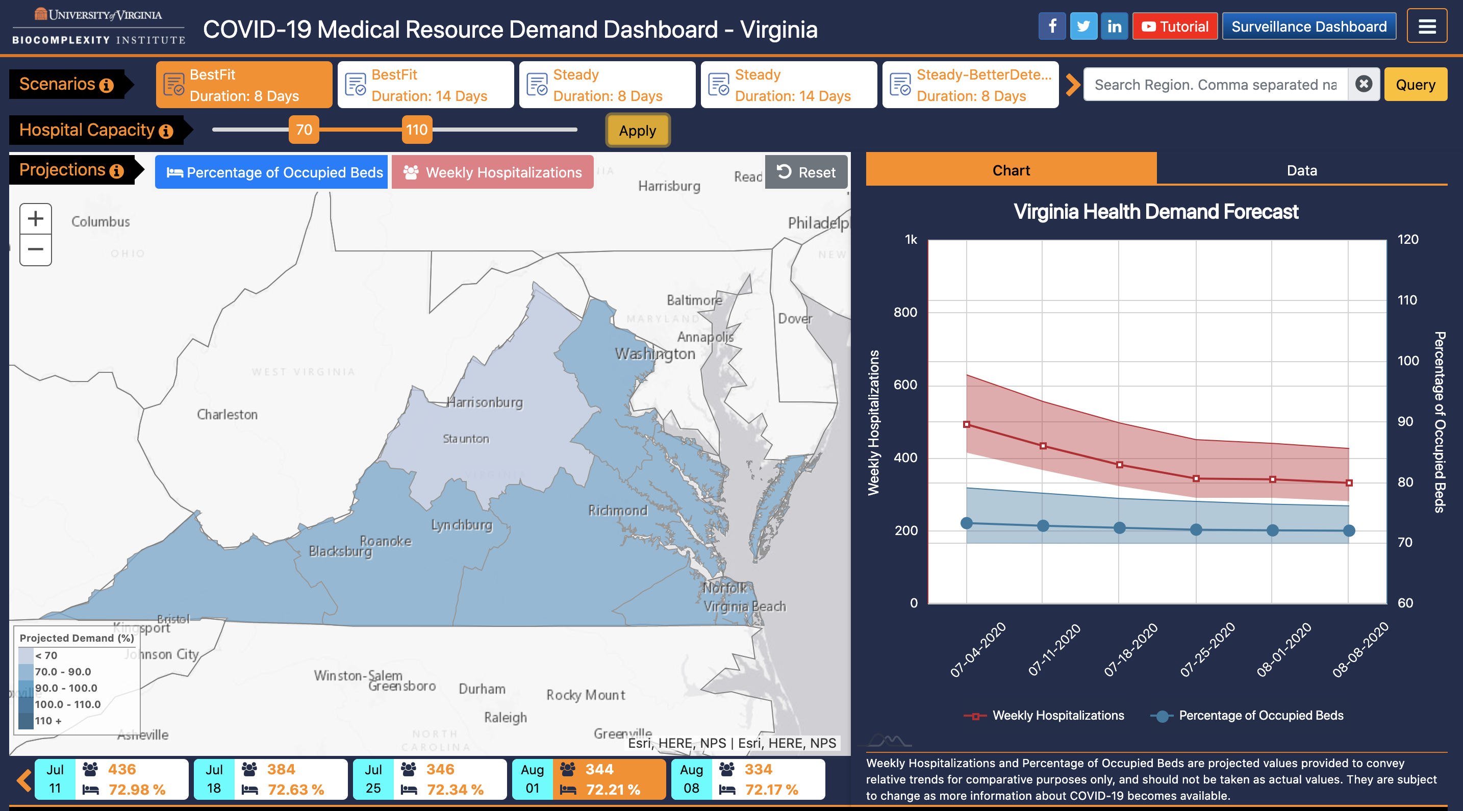
In an effort to support the planning and response efforts for the recent Coronavirus outbreak, the Network Systems Science and Advanced Computing (NSSAC) division of the Biocomplexity Institute and Initiative at the University of Virginia has prepared a visualization tool that couples epidemic simulations produced by NSSAC with hospital resource counts to project when different Virginia Hospital Preparedness Program (VA HPP) regions (also called Virginia Hospital Alerting & Status System (VHASS) regions) might hit the crisis stage due to the COVID-19 pandemic.
For a quick overview, please see the video below:
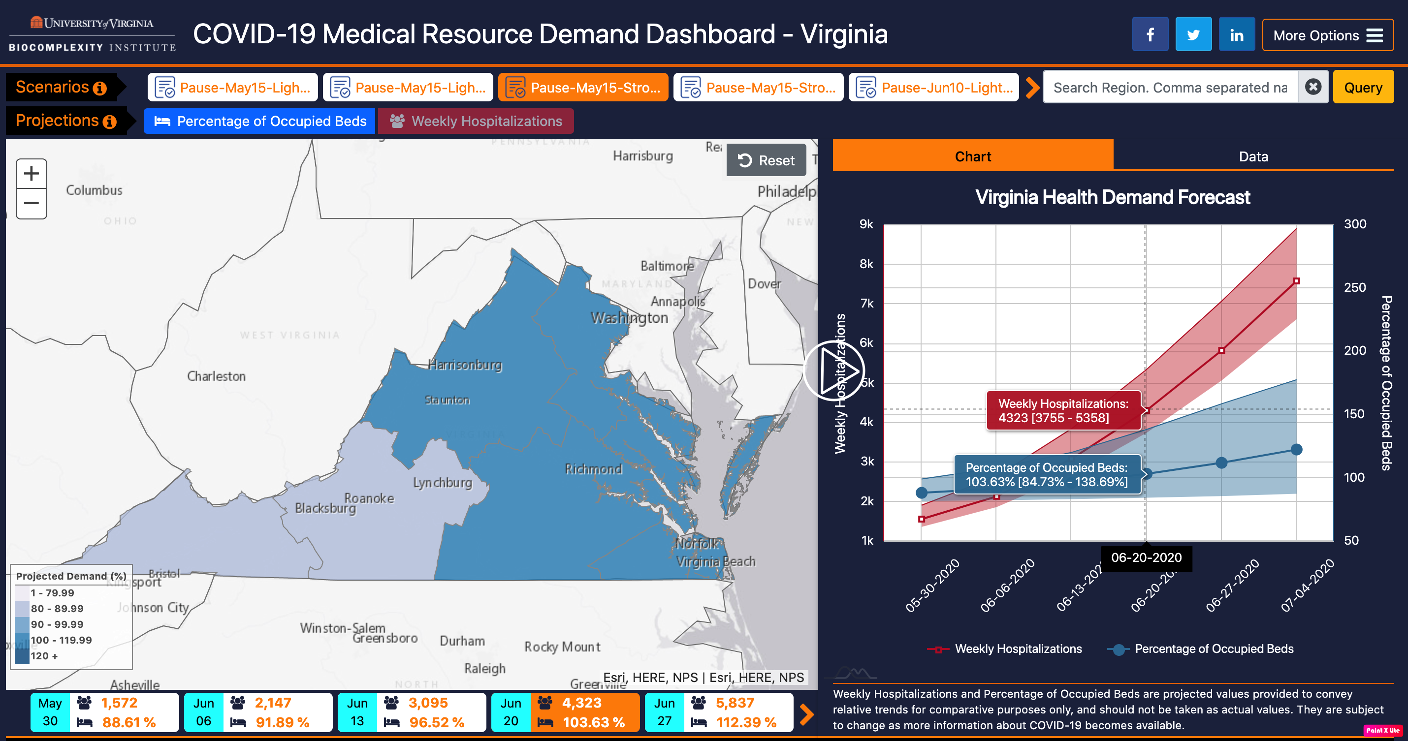
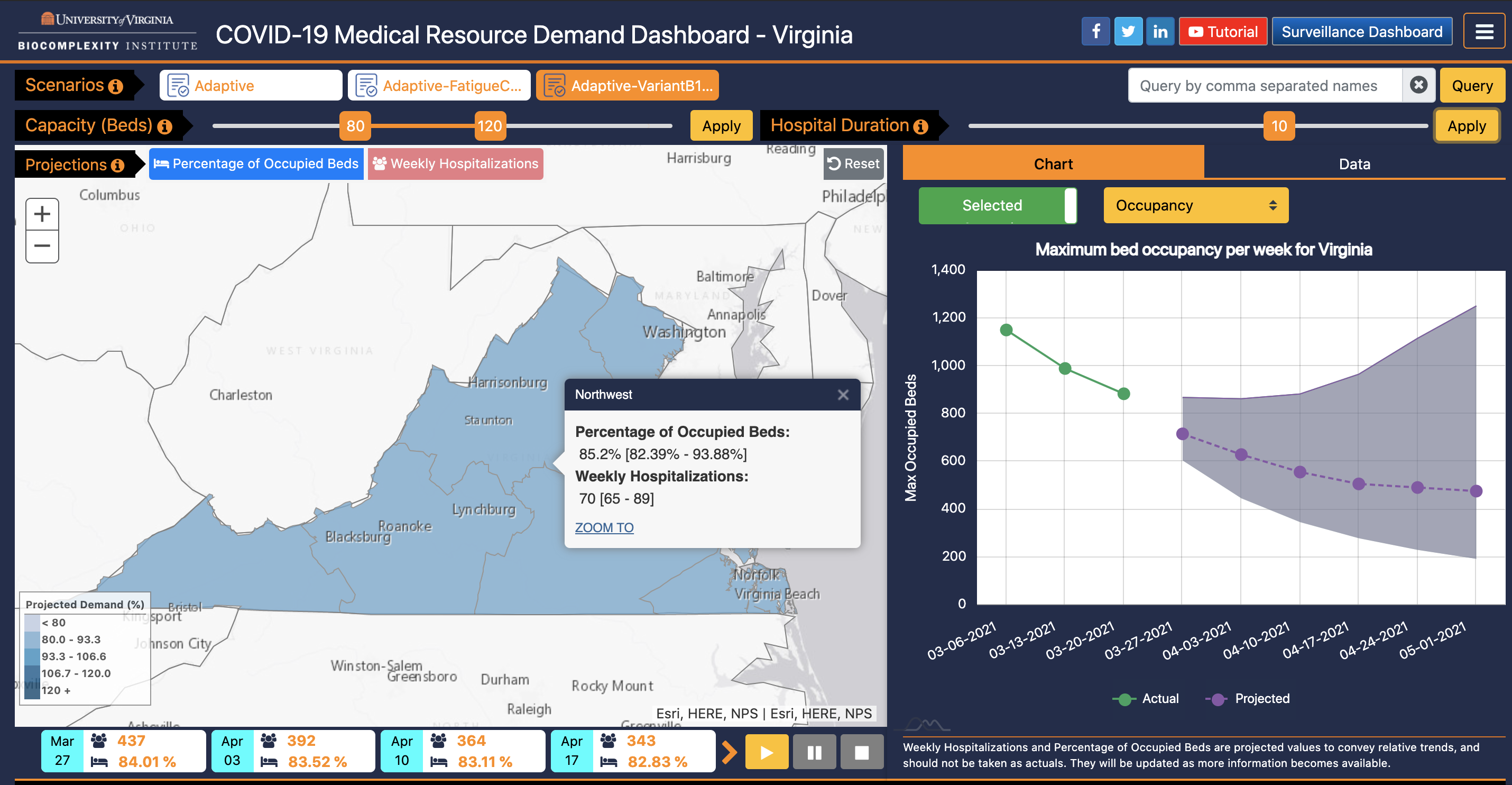
The user interface allows viewers to see:
It should be stressed that our tool shows Projections, not Forecasts. Projections are simulations that allow researchers to explore/describe how epidemic trends may behave over time depending on different conditions or the application of interventions (for example, if Virginia were to stop the shelter-in-place in May versus June.) The numeric values should not be taken as absolute or actual values because they rely on parameters that are beyond our control and subject to change. Examples of possible conditions or interventions include: the governor may adjust the stay-at-home order, the CDC may issue new guidance, a natural disaster may cause people to have to move to shelters, more (or fewer) people may wear masks, or people (or subsets of people) may stop self-isolating earlier than anticipated.
We are using a mechanistic metapopulation modeling framework called Patchsim to simulate COVID-19 behavior in Virginia. Based on past simulations we have run for national influenza models, Patchsim works by representing disease model dynamics (in this case, an SEIR, or Susceptible - Exposed - Infected - Recovered, model) within and across spatial units, also known as patches. For Virginia, our patches are the 133 counties/independent cities that make up the Commonwealth. Our model assumes homogeneous mixing of people within each patch, and inter-patch mixing is modulated by commuter traffic. Disease dynamics have been modified for COVID-19 to accommodate asymptomatic and pre-symptomatic transmissions, and disease parameters are sourced from preliminary COVID-19 estimates. To project Weekly Hospitalizations, we post-process the simulated incidence curves while applying delays and scaling parameters consistent with the latest available information on COVID-19. Finally, the weekly hospitalization projections – calculated at the county level – are translated to VHASS region-level projections based on the counties that make up each VHASS region.
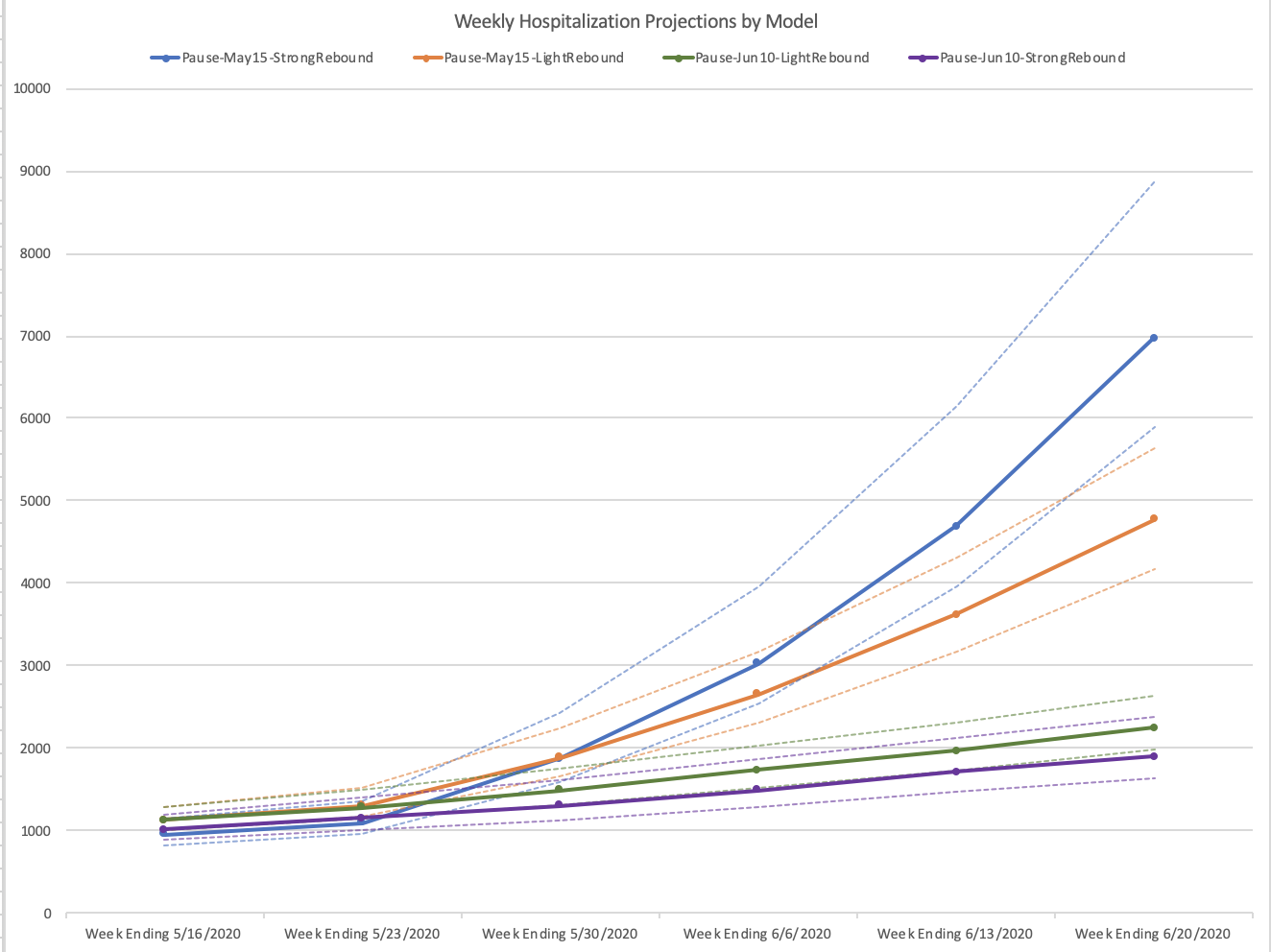
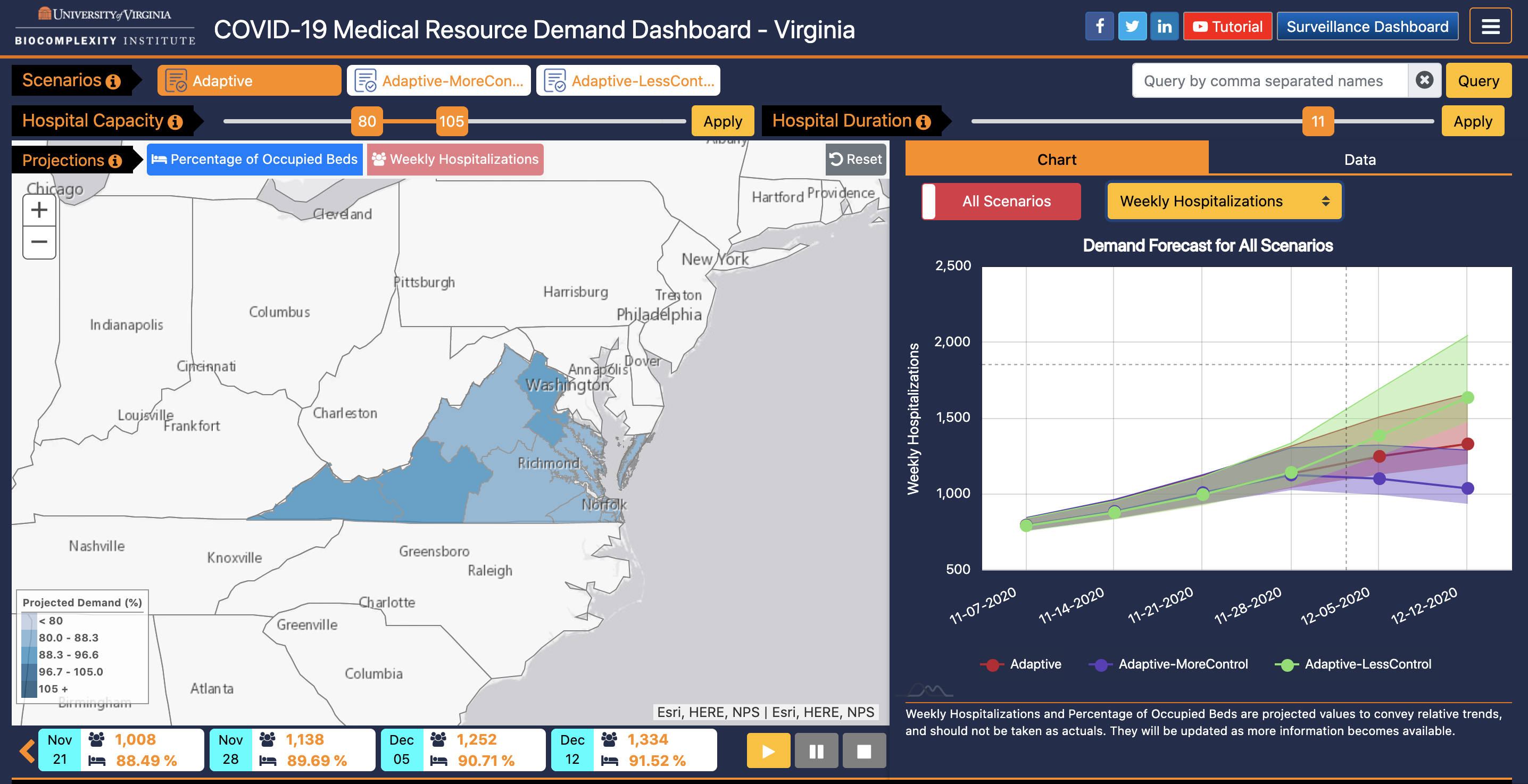
In addition to the base (unmitigated) projection of how the epidemic is likely to spread, we also run simulations that incorporate certain interventions. These interventions change over time; for example, when Governor Northam planned for a partial reopening on May 8, 2020, we ran simulations that assumed that the stay-at-home order would end on May 8th; however, when Governor Northam pushed the reopen date to May 15, 2020, we adjusted our simulation roster to reflect that. The current roster (05/12/2020) that we are running for Virginia includes:
However, depending on how things go there are other interventions we may explore, such as the impact of reopening schools or the impact of requiring some business types to remain closed.
We use the Weekly Hospitalization projections to calculate the Percentage of Occupied Beds per VHASS Region. To do this, we rely on some additional assumptions and post-processing steps.
We include the uncertainty bound ranges for both weekly hospitalizations and projections. Because these are projections and not forecasts, these error margins are quite wide to help account for unknown variables.
Supported Browsers: Firefox, Google Chrome, Internet Explorer, and Safari.
2021-04-02 Version 1.6.1 includes a couple of improved usability features.
2021-03-21 Version 1.6.0 includes the following new features:
2020-11-01 We are excited to announce the release of 1.5.0!! This release added new visualization features, including
2020-08-23 Version 1.3.0 includes two major functionality updates:
2020-07-02 We are happy to announce the release of version 1.1.0 of the Virginia Medical Resource Demand Dashboard! In the earlier releases of the dashboard, the Percentage of Occupied Beds assumed that 80% of the beds were occupied with other patients, and that most regions could accommodate up to 120% of the total hospital capacity without hitting crisis mode. In this release, users can change that lower and upper bound themselves using the new Hospital Capacity slider.
In addition, we have added enhancement to improve the look and feel of the system, including better readability of the scenarios and better synchonization between the map, graph, and timeline.
Scenarios are calibrated simulation models used to calculate projected hospitalizations and resource demands. These models depend on transmissibility parameters that indicate how contagious the disease is and the characteristics and number of people who are infected at the onset of the outbreak; they may also include interventions, such as stay-at-home orders.
Projections attempt to describe how epidemic trends will behave over time depending on different conditions or the application of interventions; unlike Forecasts which try to predict how many people will fall sick over a period of time, projections should be used as comparative trends that can be used to see more generally how are case counts are likely to grow, when are they likely to peak, and which interventions may “flatten the curve” or cause the epidemic to peak sooner or later. The numeric values from our dashboard should not be taken as absolute or actual values because they rely on parameters that are beyond our control and subject to change.
You are welcome to use data from our application, provided that you:
Per our disclaimer, UVA provides this data for academic or research purposes, and UVA provides no warranties, claims, or representations regarding this dataset.
For our full legal disclaimer:
Copyright © 2020, UVA; ALL RIGHTS RESERVED. THE CONTENTS OF THIS DASHBOARD–INCLUDING DATA, MAPS, AND PLOTS–IS PROVIDED TO THE PUBLIC SOLELY FOR RESEARCH AND ACADEMIC PURPOSES. UVA PROVIDES NO WARRANTIES, CLAIMS OR REPRESENTATIONS–WHETHER EXPRESS, IMPLIED, OR STATUTORY–WITH RESPECT TO THIS DASHBOARD, INCLUDING, WITHOUT LIMITATION, WARRANTIES OF QUALITY, PERFORMANCE, NON–INFRINGEMENT, MERCHANTABILITY, ACCURACY, ADEQUACY, VALIDITY, RELIABILITY, COMPLETENESS, OR FITNESS FOR A PARTICULAR PURPOSE, AND DISAVOWS ANY REPRESENTATIONS OR WARRANTIES CREATED BY COURSE OF DEALING, COURSE OF PERFORMANCE, TRADE USAGE OR OTHERWISE. UNDER NO CIRCUMSTANCES WILL UVA HAVE ANY LIABILITY FOR ANY LOSS OR DAMAGE INCURRED AS A RESULT OF THE USE OF THIS DASHBOARD OR RELIANCE ON ANY INFORMATION PROVIDED HEREIN. THIS DASHBOARD MAY INCORPORATE DATA OR OTHER CONTENT BELONGING TO OR ORIGINATING FROM THIRD PARTIES. WE DO NOT WARRANT, ENDORSE, GUARANTEE, OR ASSUME RESPONSIBILITY FOR THE ACCURACY OR RELIABILITY OF ANY THIRD-PARTY INFORMATION.